In Defense Of The Button

November 12, 2009 at 12:58 pm
It's no secret that we love the Button. A lot. So we were disconcerted when we stumbled across this letter to the editor of the The Pennsylvania Gazette via an old class site of KWH guru/UTB friend Al Filreis. It appears as though this letter is at least a couple of years old. And what exactly does it say? Well...
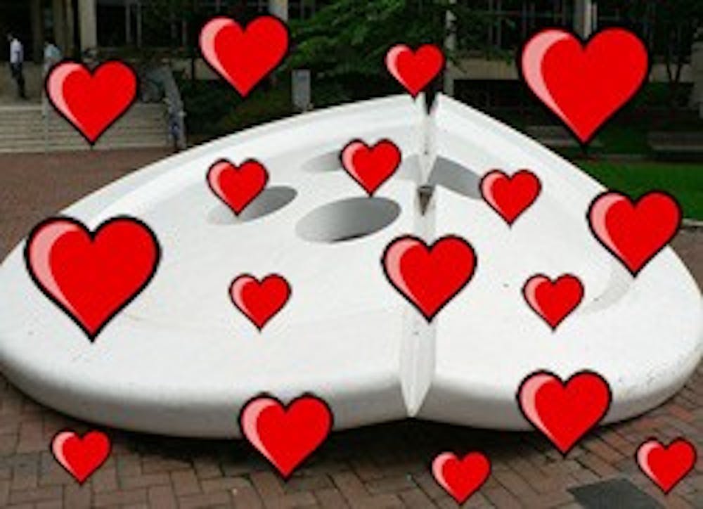
As I recently had the occasion to visit Penn for the first time in several years, I had the pleasure of reacquainting myself with the charm of the campus. Only one thing mars the calm beauty of the center of campus: the large white sculpture of a button folded on one side that sits in front of the Van Pelt Library.This button does not in the least fit with its surroundings. It is too large; it is too white; it is too devoid of meaning. Its color does not match nor its style complement any of the buildings around it, nor does it balance the statue of Benjamin Franklin, which it faces. It does not (I hope) symbolize any of the values for which Penn stands. In its current location, this folded button symbolizes nothing, except perhaps bad taste; it is simply an obtrusive eyesore.
Many things could be done to improve the situation. Perhaps it could be traded to the Rodin Museum for The Thinker; or maybe The Gates of Hell -- something with a bit of meaning, for a change. If not, there are many out of-the-way little nooks around campus that the button could adorn. I'm sure some school, building, or department could be persuaded to take it (threats to cut off funding might be of use here). Someone, somewhere in the University could find a creative use for it; there could even be a contest. Let's not continue having a folded button as the centerpiece of our otherwise beautiful campus.
PAUL FAHN, '84 C New York City
Dear Mr. Fahn,We, like you, think Penn has a beautiful and charming campus. But we think you need to view this Button business a little differently. It is not an "obtrusive eyesore," but rather a cheeky piece of pop art that actually fits in perfectly here at Penn.
What makes Penn different than Harvard, Yale and Princeton? We have a sense of humor about ourselves. We love the old school beauty of Fisher Fine Arts and College Hall, but we can't do the proper Ivy thing all the time. Thus, the Button. It's fun and it's quirky (like us!), and we happen to think it's quite nice, aesthetically-speaking.
Besides, where else would our models wear latex? Or our pledges perch? In all seriousness though, we're proud to have the Button as a symbol of our university. If you want to talk about an eyesore, let's have a chat about Van Pelt. Until then, ¡viva la Button!
Sincerely, UTB