Race To The UA 2k11: The Hardest Election Yet

September 29, 2011 at 10:00 am
Hardest election ever? Yes, we did just use that joke. And it's still stupid! But let's not forget that this year's freshmen are the best and brightest (and cutest and most supple...) of Penn, and, as such, we have high hopes for their undergraduate political body. The Race the UA 2011 is well underway at this point, and the posters are a-flappin' in the wind. This year's posters are frighteningly underwhelming, but– in one of UTB's time-honored traditions– we will nevertheless guide you through the highs, lows and what-the-hells of the freshman election campaign using an unbiased, scientifically sound rating system. To the posters!
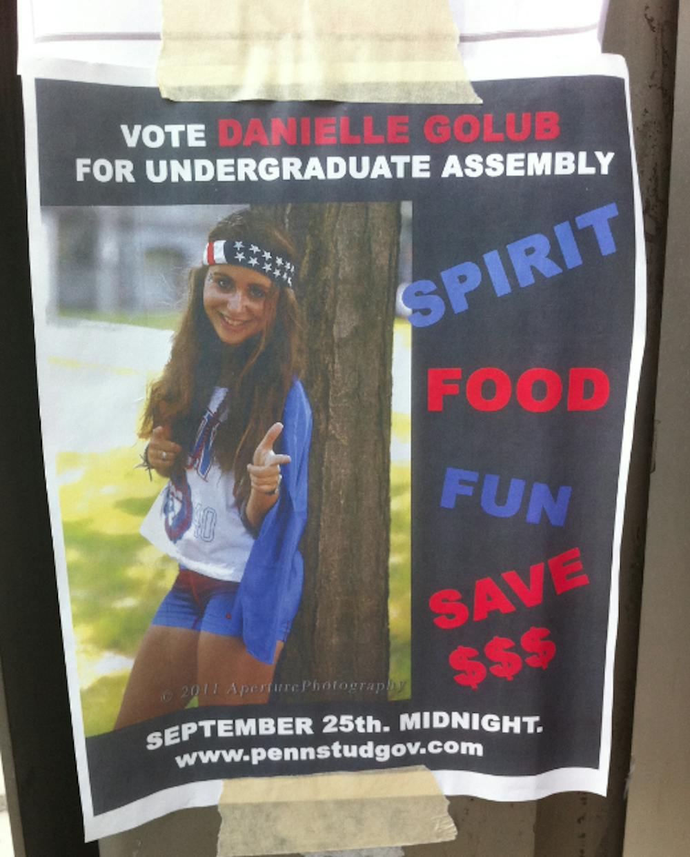
At right: Bless your heart (in a secular way), Danielle Golub, we feel like you really understand what it takes to run for the UA. We like your bold use of color, striking picture and careful balance between text and images.
Americana theme: +1776 No exclamation points: -200 Wait, are you pointing at us? You are, aren't you!?: +200 Scantily-clad thighs: -900
Total: 866
In politics and in the bedroom, less is always more. Neither of those things is true. But the old adage stands here, where we find ourselves almost overwhelmed by Willie's simple poster design.
Use of WordArt: -1589036 We like watermelon!: +45 Irrelevant picture: -45 Don't smile at us like that, we don't even know you: -600
Total: -1589636
Woah, Keven Ji! Your name sounds like Kevin G. from Mean Girls! But one is spelled normally and the other has an "e" where an "i" should be, and that's just wrong.
"Creative" name: -1 Blatant disregard for Kay Lu: -160 Blatant disregard for Kay Lu: +161 How long have you been relying on that Mean Girls reference?: -100
Total: -100
Getting people to sponsor your campaign is really hot right now. We enjoy this. We also enjoy in-your-face, bright text in really awful fonts.
Marcus says to vote for you: +20 Who is Marcus? What is PennAM? Is "A" your first name?: -21 We haven't forgotten about this: -24 Non-ironic usage of a fugly font: -185
Total: -210
Mina Saudagaran has opted for the classic election poster design of yore: just a face, a name and an inexplicable campaign slogan!
Not waterproof: -3778 "We are one": -477234 Cute border!: +5 Minimal ink usage/eco-friendliness: +6
Total: -481001
Sometimes, it's great to go down the homegrown, grassroots path when campaigning. Hand-drawn posters, cutesy rhymes and relatability: Ellery for the UA!
"Celery" rhyme, just because: +9 Poor artistic skills: -90 Cheaper textbooks would be nice: +2.5 Seemingly arbitrary choice of voids to color: +78.5
Total: 0
Everybody loves Napoleon Dynamite, right? Wrong! That movie is a real piece of work, and we hate it! We're sure you're a fine kiddo, Pablo, but poor choice, man, poor choice.
Napoleon Dynamite reference: -50 No: -743 No: -643 No: -526
Total: -1962