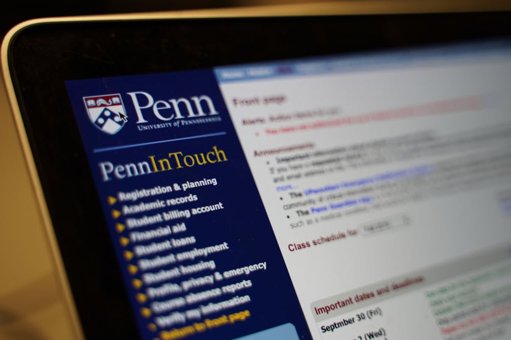
PennInTouch? More like PennIsTouch

Photo by Eric Zengclose / The Daily Pennsylvanian
November 5, 2019 at 11:11 am
Nothing turns Jack Goff (C ’15) on like the 90s-to-early-2000s-looking user interface of PennInTouch. Not to mention the frequent time-out warnings, blocky buttons, and the fact that the course search and mock schedule are two different pages.
“It’s an acquired taste,” says Goff. “At first, I didn’t know how to appreciate PennInTouch. Now, it is my favorite beauty to look at.”
Goff is a frequent user of PennInTouch. He logs on at least two or three times in one day, sometimes just to stare at his mock schedule and imagine all the things he could do with it. “I love how it greets me every time I start a session. It makes sure that it’s really me by confirming my identity. Loyalty is a big turn on for me.”
Recently PennInTouch has recently come into competition PennCoursePlan, a sleeker and skinnier course planner, with everything visible on one page, considered by social standards to be the hotter site.
“I don’t like it,” Goff complains, “It’s too up-front. Too everything-at-once. With PennInTouch, you can slowly enjoy the process of exploring different buttons and different pages. Not with PennCoursePlan.”